Look at this: “The trademark of the Kremenchuk Experimental Plant of the Research and Project Development Technological Institute of Rail Car Production.” The laconic trademark of this enterprise, created by Volodymyr Pobiedin, is in sharp contrast with a cumbersome name. The emblem of a Lviv bakery, made by the same author, looks touching: it resembles the muzzle of lion cub and a chamomile-shaped bun. The emblem of the Hadiach poultry farm shows an L-shaped chicken inside an egg-like circle.
The expressive works of the 1960s-1980s Kharkiv school of commercial art can be also of interest to modern-day designers. This is in fact one of the reasons why UNA Collective participants Uliana Bychenkova, Nika Kudinova, and Aliona Solomadina have launched an exhibition-cum-research project “ZNAK” that focuses on this point. It is displayed at the Smaller Gallery of Mystetsky Arsenal.
AN ARCHIVE DETECTIVE STORY
“As we have all graduated from the Kharkiv Academy of Design and Arts, we decided to look into what seems to be the legacy that belongs to us. We decided to find out whether there really is such thing as the Kharkiv school of commercial art and to explore traditions and the continuity of form,” Bychenkova says.
Representatives of the Kharkiv school of commercial art created dozens of “labels” in the abovementioned period for enterprises all over Soviet Ukraine, but most of their archives have not survived. “A great deal of work was done under the auspices of the Kharkiv Chamber of Commerce and Industry. This archive has been lost completely. We got in touch with the Kharkiv and Kyiv branches, but they only make helpless gestures, and nobody has the faintest idea of where the vanished archives are and who saw them last,” Kudinova says.
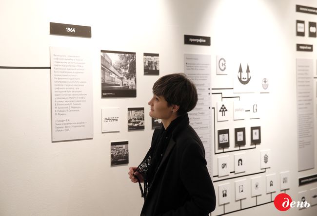
The exhibit curators found a lot of materials in the family archive of Volodymyr Pobiedin’s daughter Maryna. Some old photographs are kept at the Kharkiv Academy of Design and Arts. There are some books and catalogues with the works of Ukrainian graphic artists at the National Volodymyr Vernadsky Library.
A SHARP FORM
The origins of the Kharkiv school of commercial art date back to the early 20th century – Ivan Padalka, Vasyl Yermilov, and Borys Kosariev. The curators point out that in 1964, when the Kharkiv Art Institute was renamed Institute of Art and Industry (later, Academy of Design and Arts), Yermilov took an active part in the making of it.
“The first heroes of the Kharkiv school of commercial art in the 1960s-1980s were artists by education. Eyewitnesses say applied graphics was for them a way to earn a living. In 1962 the Soviet Union passed a law by which every enterprise must have a trade mark. This gave a major impetus to commercial art,” Bychenkova says as she guides the tour of the exhibit.
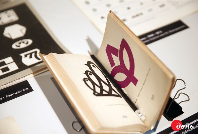
It is difficult to establish the authorship of many works today, but it is obvious that they were consonant with commercial design trends in the other Soviet republics and abroad. Solomadina characterizes some representatives of the school as follows: “The works of Moisei Fradkin in the 1960s mostly show a decorative approach, whereas Volodymyr Pobiedin, our main hero, uses a laconic, sharp, and well-thought-out form, when one detail interacts with another. His pupils and followers work approximately in the same direction. Yevhen Nadiezhdin applied a slightly different plastique. We came to know just on the day the exhibit opened that he was, above all, a ceramist – which is, of course, reflected in his trademarks.”
CORDIALITY AND BRUTALISM
In spite of stereotyped commissions – “endless amenity complexes and poultry farms,” – the Kharkiv commercial artists strove for variety and uniqueness. “They were always trying to make the best use of the region’s or theme’s name, and make the trademark look attractive,” Kudinova comments. “It is particularly Pobiedin who found many warm and heartfelt solutions. Yet some of his trademarks are in the ‘workshop spirit,’ a brutalism of sorts. It seems to me that many customers would have been scared of them as of something aggressive or just strange.”
Very few of the trademarks designed in the 1960s-1980s are used today. As Bychenkova notes, perhaps only Kharkiv’s department store and the Malyshev Plant are still using them. “The bulk of those factories, amenity complexes, and vocational schools have sunk into oblivion. They disappeared together with the Soviet Union. This is also one of the reasons why it is difficult to find information about commercial artists,” Nika adds.

Some works of the Kharkiv graphic artists have revived thanks to the exhibit curators’ experiments. For example, they hung on a big wall some elements of these trademarks in a color that was not used in the Soviet era. They also created an animated design with the help of Oleksii Romanenko, where these symbols interact in diverse colors and dynamics.
“I think we can use the Kharkiv artists’ materials in an absolutely practical key, working with identities and logos,” Kudinova says convincingly. “These designers had a good graphic school and a feeling of the form, of the white and the black. They used to find easy-to-grasp, well-balanced, and expressive solutions. We, present-day designers, ought to learn this.”
Incidentally, some graphic designers from Ukraine, Lithuania, and Poland will give several lectures as part of the project. The schedule of events can be found on the project’s Facebook page. “Attention! It may be of interest not only to specialists!” the exhibit curators warn, and it is difficult to not to agree with them.
The “ZNAK” exhibit will remain open at the Smaller Gallery of Mystetsky Arsenal until November 10.
