Transformation of the aesthetic environment, of course, should become one of the key points of antitotalitarian program for Ukraine. It means not only transformation of obvious things like, let’s say, dismantling of monuments to murderers and criminals, but also of more delicate elements of our world, for example, a font. Due to the well-known historical circumstances during the 20th century Ukraine couldn’t afford to pay attention to such things, thus, we haven’t had our own typesetting font. While Switzerland designed and perfected its famous Helvetica, which is now used all over the world and which has become one of the country’s brands. Ukraine was preoccupied with something different – with a struggle to survive.
Only today, 20 years after regaining independence, the country got its own typesetting font – a stroke that can, no matter how little, change the aesthetic environment of Ukraine. Given that we now live in the information age and consume extra large amounts of information, who would argue with a statement that a font is an important thing.
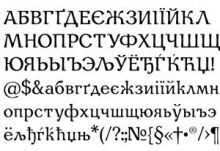
“There is a saying that intelligence is the ability to see the difference. From the point of view of an illiterate person, there is no difference between ‘antique’ and ‘grotesque.’ But if the person is literate, he certainly sees and understands the difference,” noted Mykhailo Ilko, initiator of the all-Ukrainian open contest “Ukrainian Font”, which was held by Mystetsky Arsenal (see The Day issue No.70 from December 6, 2011). Over 50 professional font designers participated in the contest. The organizers state that for Ukraine that has a small number of professional font designers it has become a remarkable event. The most important is that the winner font of the contest designed by Andrii Shevchenko (from Berdiansk) will be used not only by professional community at specialized exhibitions. According to the idea of Mystetsky Arsenal the font will soon be available to absolutely everyone.
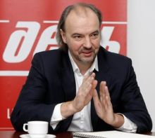
We began our conversation with Mykhailo ILKO, initiator of the “Ukrainian Font” contest, board member of the Mystetsky Arsenal Charity Foundation with the question about how he came up with the idea for organizing the contest.
“The idea for organizing a nationwide contest to create a font set appeared in 2006. Font seems to be quite a simple thing, but if a state has a certain set of characteristic symbols: language, flag, history, written language, and culture, then font can become one of them. In Europe font is considered to be one of the identification elements, that is why today even big companies and government agencies have their own font sets. Everyone who works with fonts knows that we use mostly the sets, which appeared in the West and were adapted in Russia or Soviet Union. If to look deeply in history, we will see that the adaptation of the Cyrillic script to Latin script began with Peter I. When book printing was introduced in the Russian Empire, the printing technology was, in fact, imported. Of course, the printers were interested in leaving most of Latin drop letters unchanged and design only some that were different. That was the time when Cyrillic has changed noticeably. It is well known that rhythm and aesthetics of a font are defined by, so-called, kern. In Latin they can be seen in letters d, k, and l. Before adaptations our writing almost didn’t have such letters. Later those technologies were developed in Soviet Union. Book printing became centralized. There appeared nice font sets – Pragmatics, for example.”
Was font one of the elements of propaganda machine? Were there special fonts that were used for some special purposes?
“One can hardly say that fonts were propagandistic, but sometimes they do have specific goals. For example, Pragmatics was created specifically for the publication of the Great Soviet Encyclopedia. There was a huge amount of material that is why a dense font was needed. Times newspaper has developed its own font set because due to increased advertising space they also faced the need to make articles more compact. For creating another famous font – Helvetica, a special program was implemented in Switzerland. The Swiss managed to develop this simple and pragmatic font so that it became the most popular font today.
“The successor of the Soviet Union – Russia – has reserved rights for the history of font creation. That is why in the late 1990s, when computerization of font creation took place Ukraine was left far behind. Even though we have a good calligraphic tradition, we were left without our own typesetting font, because Ukrainian developments in font creation remain unknown.”
In what books is Ukrainian font tradition set first of all?
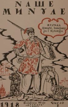
“Creation of a full typesetting font means designing all font characters with different formatting. It is a costly project and is possible only when there is an order for it. Let’s say, Great Soviet Encyclopedia was such an order. Of course, after it was published Pragmatics didn’t disappear, it was reproduced, was cast in large quantities and transferred to other publishers. If to look at the Ukrainian culture of the 20th century, was there a possibility to create full Ukrainian typesetting font in such conditions? Obviously, no, there wasn’t. Thus, fonts were not created because there were no social and state orders. However, there exist a few fonts that were created for certain publications, like Narbut’s alphabet and Khomenko font. Those fonts lack some new characters. By the way, in Lviv there is a wonderful font designer Henadii Zarechniuk, who digitized Khomenko font.
“Of course, the situation nowadays is not as dramatic, but there are not many people in Ukraine who are working on font design professionally, just because nobody needs it. If a country can’t solve its language problems what can be done about fonts? Some might point out that it makes no difference what font was used to write something. But it makes a difference to us. The font that was selected as the contest winner conveys the melodics of the Ukrainian language and, at the same time, it is modern and, so to speak, globalized.”
How can a person recognize Ukrainian character in a font?
“The features of Ukrainianness can be purely formal. For example, when I developed the design for Eurovision [Ilko was the creative director of the Song Contest Eurovision 2005, the finals of which took place in Ukraine. – Ed.], people asked me: ‘What are the Ukrainian features of your designs?’ They’d mention that Ukrainians like wreaths and embroidered towels. I also like those things, but culture is in deeper things, in elements, which become obvious not right away, those that we recognize in intonations. The same is with the language. We write down sounds, but every person pronounces them in his own way. One word can have a few shades of meaning not because of the letters set but because of the elements of sound performance.
“The winner font is very humanistic. It has somewhat narrowed proportions, thus, it has a lyrical character. Why is it Ukrainian? Let’s say, just as the Cossacks marches have their own special lyrics, this font has its own lyrics too. It seems to me, that this constitutes its Ukrainianness. At the same time, it is deprived of formal features of a Ukrainian something.”
So Ukraine will soon have its own font?
“We hope that it will be widely used. We will purchase the rights for distributing it and will give it out for free use.
“If you have something good and it costs nothing for you to share this good with others you share, discuss it, and extend it – this is the way culture is created. Culture is conscious behavior of people in an agreed system of coordinates.
When this font will be available for everyone, we will exchange it, will use it in everyday typing, and will give it to friends. It is one of the ways to change something around us. A person can try to save the world, but s/he just as well can try and make something small that could bring real changes. We choose small victories for real change.
“Our goal is to create a typesetting font for everyday use in business and office work, which, I emphasize, will be distributed for free through a special website. It means that this font has to be readable, neutral, well-compatible with other fonts, and functional for typing. We have found such kind of a font! Now we will do everything we can so that it will become a standard set of PC software in the domestic market.”
What did you see in projects submitted for the competition? What people took part in it? Perhaps, it is a new generation of Ukrainian designers?
“There are really such people in Ukraine. However, there are not so many font designers in Ukraine. It should be noted that the most difficult task for a graphic designer is creating of a typesetting font. That is why, when we announced the contest, we dreamed about having at least five good projects submitted so that we would be able to pick up the best.
“We received nearly 50 projects mainly from Kyiv, Kharkiv, Lviv, Berdiansk, and Luhansk.”
Is Ukraine capable of creating a cultural product that will be interesting to the world?
“Ukrainians, as a creative unit, as an author, are capable of creating such things and are doing so, while Ukrainian society is not capable and does little to change it. In order to create such product, society has to change. At the present moment, there is no critical mass of people united by certain culture and values. There is an acute problem of moral and cultural degradation. For society to be able to produce products that will be competitive in the modern world, it has to be based on principles of respect for people. We have to learn to acknowledge achievements and success of our colleagues and multiply them. In fact, this is the way culture is created.”
The Day’s FACT FILE
Mykhailo Ilko was born in Tiachev, Transcarpathia. He grew up in Uzhhorod. His father, Ivan Ilko was an artist, a painter. “I as if continued in his path,” says Mykhailo Ilko. Ilko studied in Art College in Uzhhorod, in Kyiv State Art Institute (present Academy of Art and Architecture). In the 1990s together with his friends, Ilko began working in sphere of commercial design. In 2005 he became the creative director of the Eurovision Song Contest. In 2007 Ilko was the creative manager of Ukraine and Poland’s application process for Euro-2012. At the present moment he is a board member of the Mystetsky Arsenal Charity Foundation.
COMMENTARY
Olha VIERU, head of Mystetsky Arsenal Charity Foundation:
“Ukrainian font culture is in a very pitiful state nowadays. Unfortunately, we have very few experts in this area. Meanwhile, one of the main priorities for Mystetsky Arsenal is creating such conditions, in which talented people could develop their skills and realize their potential. And this font contest gave a rare opportunity for the font masters to express themselves. This is a local goal of the contest, so to speak. As far as the global goal is concerned, it is the first time that a font is being created in Ukraine, which we as the masterminds are going to introduce not only in Ukraine, but in other countries as well. Most of the fonts are associated with various nations. So why should Ukraine not have one of its own? By the way, during the preparation for the contest we had had constant discussions about the meaning of the expression ‘Ukrainian font.’ Is it a kind of font that has some peculiar artistic features that make it Ukrainian? Or is it a font that was created in Ukraine? At this point opinions were divided. But I am inclined to think that anything created in Ukraine can be called Ukrainian. Though it must be said that the winner font of the contest possesses some peculiar features that directly confirm its Ukrainian origin, like lyricism, for instance.
“I hope that soon we will succeed in achieving our main goal: we will buy the rights for one of the fonts and make it free for public use, so anyone can benefit from it. I am not a fan of loud words, but it is an element of patriotic upbringing, if you please!
“Besides, we chose 10 best fonts out of all that were sent to the contest. There are different fonts among them that can be used for different purposes. Now we want to address the authorities and propose a whole program based on this contest. The importance of such action is profound, while the expenses are quite low.
“The font is a ‘dark side’ of our culture, it sort of stays in the shade. Not so many people realize the importance and the meaning of it: ‘Alright, it is just a font. So what?’ If we promote a different attitude and understanding, people will pay more attention to font culture, they will understand the reasons why it is important. And in its turn, font culture will shape and grow, giving boost to other positive esthetic shifts in our society.”
