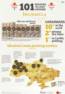
All these years, Den presents otherwise dry and lifeless data through the entertaining language of interactive facts. Charts, tables, graphs, collages – our audience is fully accustomed to them; these means contribute to the readers’ immersion in the texts, show the essence of the article’s information and improve the aesthetic appearance of the pages. And over the course of the past several years Den has advanced further on this path, relying on the modern infographics made by our journalist Yaryna Mykhailyshyn. During that time more than a hundred unique pieces of infographic appeared on the pages of Den/The Day, Route No. 1 glossy and Ukraine Incognita website page, covering the hottest topics: “Protest week on Hrushevskoho street,” “Euromaidan: achievements,” “A memo for Ukrainian protester,” “The travelling country: Crimea, the south, Halychyna, Kyiv region, Cherkasy region, etc.” rubric, “101 reasons to love Ukraine” project and many others. Every such piece receives wide circulation in the social networks and blogs.
Yaryna Mykhailyshyn describes her work with Den/The Day and discusses the response each infographic gets.
“About two years ago worldwide media experienced a boom for infographics. It was a kind of trend, season hit, something new and wildly popular – though the actual charts, graphs, and illustrations boast not less than three hundred years of history in newspapers. Nevertheless, the development of social media and the growth in website attendance made the Internet the principal channel for information and the traditional methods of conveying it required the appropriate changes. It was the time when we decided to start making infographics and developed some of it for ‘Ukraine Incognita’ project, which offered very powerful and detailed text on historical topics. A reader might have only 20 minutes to read news in the morning and a little more in the evening, so he needs something to help him comprehend the material. Or at least something to keep him interested enough in order to come back reading in the evening. And we made it! The projects were popular, we began expanding the range of the topics, methods and even languages. And here in Den we established a number of infographic series: ‘The scientific country,’ ‘The travelling country,’ and, finally, ‘101 reasons to love Ukraine.’ But the infographics market was growing and there was still a struggle for the audience’s attention.
“After the first wave of static infographic a new trend emerged – more complex interactive projects, long-reads accompanied by visualization, etc. It was a real challenge. Only recently the journalists had learned the ropes of convergent press (a symbiosis of photo and video with more traditional analysis, report or interview), and now they were required to become proficient in statistics, programming, and design. Keeping in mind that our journalism education retains most of its traits from Soviet era, it was a jump over our heads. But we had no choice but to make it. During Maidan the new methods were implemented on the fly, the flow of information was overwhelming, but the relevance of information was critical – we had no time to lose. And then we created our first interactive visualizations. I clearly remember one example, how we worked on the interactive map of how Lenin monuments were demolished. It was undoubtedly a historical event, anticipated by many generations of Ukrainians. The significance of this mental revolution is so far-reaching, that now we cannot even fathom all its consequences. But when the time comes to reconsider and analyze, we would be able to recreate these events with extreme fidelity, because thanks to our visualization we possess unique data on where, when, and at what intervals main squares and streets of towns were cleared of communist symbols. Then, in the period from December 2013 to February 2014, the work on this project was extremely exhausting. We had to constantly, day and night, monitor social networks and newsfeeds, check all the sources of information and update the map almost every minute. And when the project became popular, the readers themselves began filing the reports on Lenin’s fall in this or that town. Our little initiative had grown to all-Ukrainian marathon which helped comprehensively document this historic event.
“Today the members of Den’s team continue their work on visualization and infographics. We try to use the technology to its fullest potential, and thus we are not scared to use new instruments and methods. Our main task is to show the reader the actual reality and provide them with an instrument to analyze and study the topic on their own. Infographic is not a comic strip made for likes and reposts, it is an in-depth analysis and a synthesis of the primary data, made for better comprehension. And today it is more relevant than ever. Politicians love to juggle the figures and to speculate on facts, and journalists often fall on that hook, echoing the better or worse values of ‘the new life.’ But a number means nothing without a context. We need to see the prerequisites and consequences to grasp the essence.”


